Overview
Oculid was a 12-person startup offering a SaaS platform to create remote eye tracking studies. It enabled user research of digital products on mobile, with advanced eye-tracking metrics.
Oculid’s marketing video when I joined the startup
Oculid products

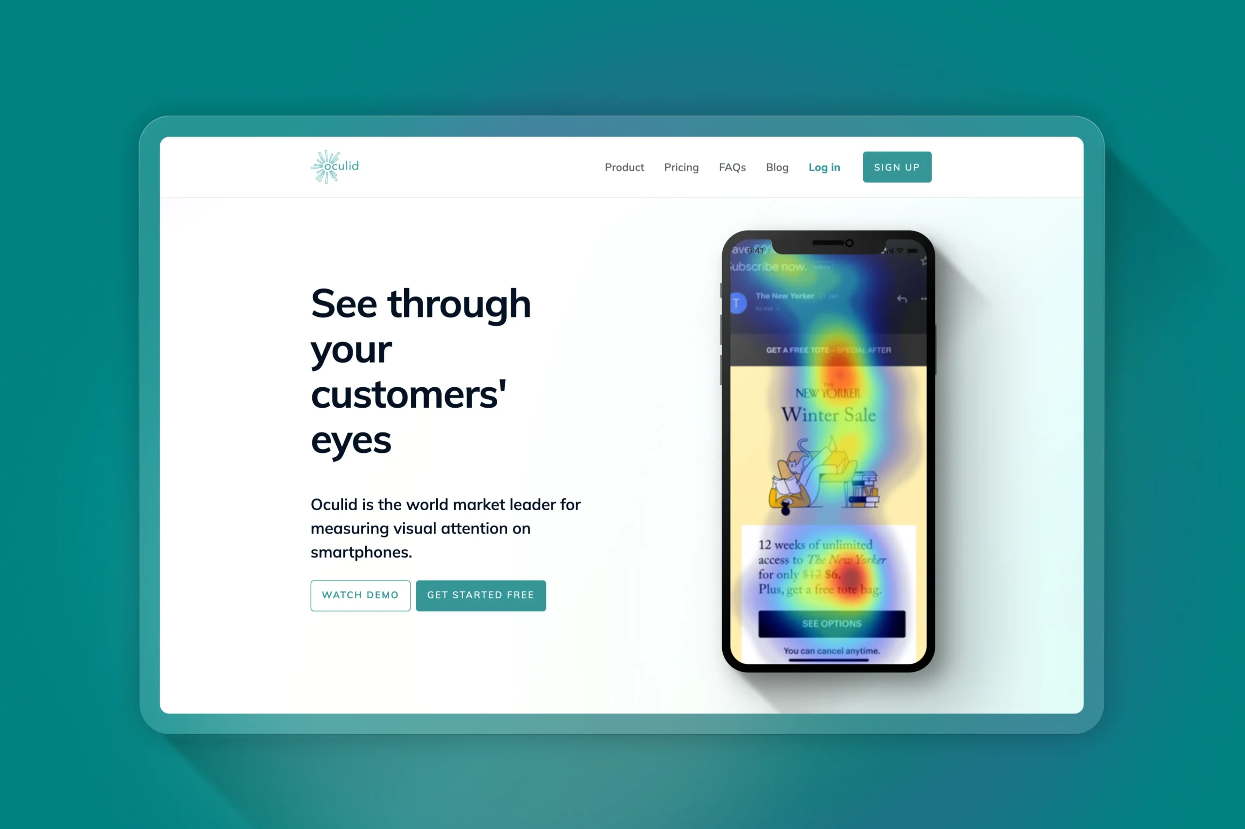
Website
To showcase the Oculid products and help users with guides.

Web Platform
For researchers to create eye tracking studies and analyze results.

Mobile apps
For test participants to run the eye tracking studies (iOS & Android)
Problems
This were the main problems Oculid faced when I joined the team.
Inconsistent design
Lack of visual unity and cohesion among different products.
Feature gap
Missing essential features like a sign-up process and advanced data visualisations.
Churn
Occurring at multiple points in the user journey in web platform and mobile apps.
Low data quality
Due to poor participant behaviour during remote eye-tracking tests.
My work
I focused on these key areas to drive improvements.
My work
- Design strategy
- UX research
- UX copy
- UI & Visual design
- Design Systems
- Web design & dev
Team collaboration
To redefine the roadmap and plan work:
- 1 Product Owner
- 1 UX Researcher
- 1 Product designer 👈🏼 Me
To discuss design solutions and hand over end designs:
- 2 Data Scientists
- 1 Front-end dev
- 1 Back-end dev
- 1 iOS dev
- 1 Android dev
Research 🔬
Previous research identified problems, but it wasn’t always clear WHY those problems occurred. I conducted these methodologies to better understand the roots of important problems.
Heuristic analysis
I tested the web app and apps documenting places for improvement.
Usability tests
I recruited real users to test designs while gathering user insights.
User interviews
I helped gaining a better understanding of the experience and perception of the products by our users.
Persona profiles
I created persona profiles and progressively developed them to consolidate the information gathered about our users.
User journey mapping
I mapped user journeys noting places for improvement.
Solutions 🛠️
UX research helped understanding the “WHYs” of the problems. This is how I tackled some of them.
To reduce design inconsistency:
Design System
I expanded and improved the design system in Figma, adding important sections and components, progressively applying it to all products to enhance consistency.
Accesibility & consistency
I applied accessibility principles from WCAG and W3C, and a minimalist design to reduce cognitive load and enhance clarity.
Custom graphics
I created icons and illustrations to unify the visual style across products and better support instructions.
To reduce churn and low data quality:
Fix user journeys
I designed new screens, UI elements, user guides, landing pages and emails to fix user journeys and help users achieving their goals successfully.
Build trust
I addressed the lack of trust in the mobile apps –which required a number of sensitive data like face recording to work, by emphasising privacy features early on, reorganising the app’s structure and improving the overall visual design to evoke a more professional and trustable look.
Improve Onboarding
I reorganised the screens in a more intuitive and logical way, and improved instructions applying story-telling and micro-copy techniques to better guide users.
To reduce feature gap:
Sign-up flow
I designed a sign-up flow from scratch to automate account creation and gather relevant user data.
Email flow
I redesigned and developed all the emails derived from the platform usage to emphasise key information and clearly guide our users towards the next step.
Dashboard sections
I redesigned parts of the analytics dashboard with eye-tracking metrics to improve clarity, and designed new sections like AOIs (Areas Of Interest) with data visualisations.
Examples of end-designs with illustrations made by me:
(I can’t show more due to my NDA, get in touch for more details!)

Impact 💥
Onboarding redesign improved participant compliance in critical moments for remote eye-tracking
Across 11 moderated, non-directive usability testing sessions (task prompts + silent observation), participants adopted the required positioning when guided by the redesigned onboarding—supporting calibration success in remote mobile eye-tracking.
Posture compliance improved from 86% (6/7) in round 1 of the testing sessions, and to 100% (4/4) in round 2.
Before the redesign, production analytics indicated major drop-off (only ~50% participants reached test completion), consistent with positioning/calibration being high-risk steps.
Post-launch funnel impact couldn’t be validated because Oculid was acquired by Tobii during implementation—so this case study reports just validated risk reduction from these sessions.
Cohesive and accessible design
By improving and applying the new design system across all Oculid products I significantly increased the visual and functional consistency of the Oculid product suit. This not only strengthen the brand’s professional appearance, but it also helped building trust with the users from the first interaction. By applying best UX design principles, it also improved usability and accessibility across all different touchpoints.
Resolved 65% of found usability issues
Of the 120 usability issues identified through usability tests in the web platform, over 65% were successfully resolved, significantly increasing the user experience of the platform.
Company acquisition
The refreshened visual design and ease of use of the Oculid products were cited as a key factors in its successful acquisition by Tobii, the global market leader in eye-tracking software and technologies.
Career advancement
My contributions to Oculid’s growth and product quality enhancement led to a promotion offer during the Tobii acquisition.
Final thoughts:
Working at a cutting-edge tech startup like Oculid meant wearing many hats and tackling some of the most exciting challenges I’ve faced as a designer. I conducted eye-tracking research studies for the first time, literally seeing my designs through my customers’ eyes, which is a privilege for a UX researcher. As the designer and also the target user for the Oculid tools, I played a key role in shaping both the web platform and apps.
Being at a company led by HCI-trained CEOs who valued research and data, I was encouraged to plan, conduct full design processes and test. This allowed me to test design ideas and assumptions with real people.
I also gained hands-on experience collaborating with data scientists, developers, sales, marketing, and product managers, trading and prioritising tasks worth pursuing. At the end of the day, we were a small team that needed to focus to not waste limited time and resources. The fast-paced environment taught us to own our processes, learn quickly and adapt constantly.

Leave a Reply
You must be logged in to post a comment.