Design Process
“Tasko’s” design process was focused on the Lean methodology: Involving potential users early on, testing designs and analysing data to develop user-centric features from the very beginning.


Competitor Analysis
Learning the business strategies that similar products are using, understanding how competitors present themselves, what value they provide, and learning from their strengths and weaknesses can be a great help to define our own product and come in strong in a highly competitive market.


I chose three similar task management web apps -“Meistertask”, “Asana” and “Trello”- and compared them. They are all based in Kanban managament systems and have similar dashboards. They have similar approaches regarding task and project management.
Product profiles
Knowing the needs and motivations of your product’s target group, and identifying which ones are unmet by its competitors can help enormously to detect growth opportunities.

I thus created product profiles with each of the tree competitors: MeisterTask, Asana and Trello, to compare them in detail and understand Tasko’s target group and opportunities better.
Defining Tasko
After analysing competitors in depth and understanding the needs of my target group better, I started defining Tasko.
Tasko’s target market and concept
1. TASKO’S INDUSTRY
Primarily artists and visual thinkers: Thought to be approximately 65% of the population.
A large body of research though indicates that visual cues help humans in general to better retrieve and remember information, so even if individuals with more developed visual thinking skills will be expected to be the most interested in Tasko, most people would potentially like a visual system like it.
2. TASKO’S TARGET MARKET
Visual thinkers:
• Artists
• Designers
• Film makers
• Physicists
• etc…
They can work as:
• Employees
• Freelancers
• Students
in:
• Public Institutions
• Companies
• Organisations
3. CUSTOMERS NEEDS
Tasko should:
• Have plenty of visual features and cues
• Be simple and easy to use
• Help sketching ideas, saving and sharing them easily
• Improve project visualisation
• Improve team work
• Enhance communication
• Improve time management
• Help prioritising tasks
• Prevent procrastination
• Enhance feelings of self-actualisation
4. GROWTH OPPORTUNITIES
to stand out from competitors:
• Minimalist and intuitive design
• Easy and fun to use
• Aesthetic and polished interface
• Great status-visibility
• Customisable app look
• Sync between devices
• Dashboards and teams
• Projects and tasks
• Attachments
• Team members with roles
• Kanban and list layout for projects
• Project advancement monitoring
• Built-in time tracking function
• Built-in invoicing tool
• Mayor productivity apps integrations
Tasko’s First MVP
As its names indicates, a MVP or “Minimum Valuable Product” is a product composed by the minimum number of features that are needed for it to be viable. Building an MVP rather than a final product saves enormous amount of time and resources. With an MVP, the most important features and the viability of a product can be tested in early stages of the design process of the product.
If during user tests we realise that a product is a failure, or needs to be extensively reworked, we won’t have wasted all the great resources and time required to build a perfectly finished product. If, on the other hand, the MVP of a product turns out to be succesful, it can always be implemented with new features and functions.
Description:
Tasko will be a web app with projects, notes and calendar. It will help visual thinkers to manage their daily tasks.
Categories:
Collaboration, Task Management, Project Management
Must-have features:
• Kanban dashboards with drag and drop
• Projects and tasks
• Members
• Attachments
• Due Date
• Reminders
• Checklists
• Device Syncing
• Calendar with projects, tasks and meetings
• Calendar: day, week, month & year views
• Color coding: ie..: Priority tasks in red, etc
• Custom pages with attachments (pictures, sketches, texts, links…) for ideas & inspiration
• Professional and personal projects sections with tasks
• Mayor productivity apps integrations (google cal, ical, gmail, dropbox, etc…)
• Assign tags to tasks
• Assign tasks to people
• Trendy, minimal and intuitive design
Nice to have Features:
• Time tracking
• Simple invoice
• Checklists with progress meter
• Subtasks
• Drawing tablet integration (Ipad, Wakoon,…) People can use their digital pads and pens to add sketches or hand-write directly in Tasko
• Voice recognition to add tasks and events
• Chat for teams
• Interests page with custom lists
This first MVP is a draft build with conclusions gotten from the competitor analysis and own assumptions about Tasko’s target group. I will run different user tests during the design process to validate such assumptions and iterate in the M.V.P accordingly.
The objective is to make sure that the last MVP, once built, will really solve the main problems from Tasko’s users, when it comes to project and event management.

User Research
As I mentioned before, UX designers need to determine the best type of MVP for their products as well as which features are absolutely necessary to them. To do this we need to conduct user researches with early adopters.
An early adopter is someone who embraces new technology before others. They must belong to the product’s target group and be willing to give some time for testing sessions. Is very important that they are honest with their feedback.
Early Adopters:
I identified five early adopters for Tasko’s:
- Isa: Artist, ecologist and teacher
- Gudrun: Artist and filmmaker
- Marta: Artist and Musician
- Annika: Artist and librarian
- Magdalena: Fashion designer
User Survey
User surveys are a great way to gather quantitative data about a product’s potential users. With the information I will gather, I will validated assumptions made about Tasko’s users motivations and needs. It will ultimately help me to decide if I’m focusing on the right features for Tasko.
1. Test preparation
Type of test:
Virtual; I sent the surveys via email.
Equipment:
Device with internet.
Survey link:
Schedule and location:
The test takes 30 – 40 minutes.
Test participants could do the online survey at their pace over the span of three days.
Test goal:
Validate next hypothesis:
- Visual features will be preferred by the target audience.
- The target audience is mostly made up of artists and freelancers.
- Confirm or identify target group’s preferences when organising their duties.
Testers
I recruited test participants that corresponded to Tasko’s Target group: highly visual thinkers.
The target audience was between 18 – 55 years old.
12 people took part in the survey.
2. Test results
This are just some examples of the survey questions and answers.
How old are you?
Intent of the question: The tree first questions in the survey aim to filter participants to only select real target users of Tasko.
86% of the survey participants were 26 to 45 years old. They responded to Tasko’s user target so their answers will be considered as valid in this survey.
What’s your occupational field?
Most of the participants belonged to occupation fields related to visual thinking: Artists, designers, art educators… They are Tasko’s ideal users. Their answers will be considered as specially relevant in the survey. The answers from people from non related jobs like “sales” won’t be consider in this survey. This is a way to really focus on the needs of our target users.
How do you work?
Most of the survey participants work as freelancers. This validates an assumption made previously about our target group and helps focusing on solving the particular problems that raises with this particular group of workers.
What analogical ways do you use to manage your tasks?
Figuring out how people organise their tasks -not only with what digital tools, but also with what analogical ones- helped me foresee a substitute for them in the digital world, or a new improved digital solution.
3. Conclussions
This were the key findings derived from the user surveys.
Main ocupation:
- Art & Design
Main way of working:
- Freelance
Use digital tools to manage daily tasks:
- 66.67%
Most popular analogical tools to manage daily tasks:
- To-do lists: 88.89%
- Head: 44.44%
- Post-its: 33.33%
- Calendar: 22.22%
Most popular digital tools:
- Digital calendars: 85.71%
- Digital To-do lists: 57.14%
- Kanban apps: 14.29%
- Post-its: 14.29%
Most important aspects for a task management app:
1. Easy to use
2. Not too many functions/ fast to learn
3. Technically reliable
4. Logical use of color
Preferred features:
1. Checklists / To-do lists
2. Attachments
3. Calendar with day & week overview
4. Visual overview of task-projects
5. Set deadlines
6. Manage professional projects
Irrelevant features:
- A lot of functions
- Fun to use
- Agenda or diary
- Reminders
- Virtual assistant / dictation
- Simple invoices
- Track working time
Not as important:
- Aesthetic design
- Collaboration
Tasko’s Second MVP (revisited)
I used the test results from the user survey to iterate in Tasko’s MVP. The crossed-out features are the features for which users showed the least interest, for this reason we deleted them from the MVP. The features that stay due to the interest showed by our target users, stay for further testing.
Must-have features:
• Kanban dashboards with drag and drop function
• Projects and tasks
• Members
• Attachments
• Due Date
• Reminders
• Checklists
• Device Syncing
• Calendar with projects, tasks and meetings
• Calendar: day, week, month & year views
• Color coding: ie..: Priority tasks in red, etc
• Custom pages with attachments (photos, sketches, links…) for ideas & inspiration
• Professional and personal projects sections with tasks
• Mayor productivity apps integrations (google cal, gmail, dropbox, etc…)
• Assign tags to tasks
• Assign tasks to people
• Trendy, minimal and intuitive design
• Visual overview of tasks and projects
Nice to have Features:
• Time tracking
• Simple invoice
• Checklists with progress meter
• Subtasks
• Drawing tablet integration (Ipad, Wakoon,…) People can use their digital pads and pens to add sketches or hand-write directly in Tasko
• Voice recognition to add tasks and events
• Chat for teams
• Interests page with custom lists
• Collaborative
• Aesthetic design
• Manage personal projects
• Calender with yearly overview
• Sync. your personal calender (Google cal, iCal…)
• Notifications and reminders
• External apps integrations.
This second MVP with the core features for Tasko is still a draft. I keep running different user-test methods to make sure that the last MVP encompasses the core features for Tasko that really speaks to its user needs.
(For the span of this presentation I will skip further MVP iterations and focus on test results, documentation and design iterations.)


Users are the most important source of feedback when it comes to effective UX. Nearly every design-decision of my web app were based on user research and Tasko’s user personas.

An effective persona will:
- Represent a major user group for Tasko.
- Focus on major user group needs.
- Give a clear picture of how they will use Tasko.
- Aid in uncovering universal features.
- Describe real people with characteristics.
- Help testing assumptions about users.
- Assist prioritizing features for Tasko.
I thus created user persona profiles to consolidate the information gathered about Tasko’s potential users. They create reliable and realistic representations of the main user groups that will be using Tasko.


Information Architecture (I.A.)
The information of a website or app can be extremely hard to navigate without a logical and well thought out system, and in today’s rapid world where users expect instant results, complex and difficult to navigable websites are abandoned in a matter of seconds.
An intuitive and effective information architecture is thus essential for a site to enable users to navigate smoothly and with the reassurance that they’re getting what they are looking for.
At this point in the design process is when I started defining Tasko’s Information Architecture. I used different testing methods -for example a “card sorting” session, to define how to organise its main structure.

Card sorting
The “card sorting” technic helps evaluating assumptions and generating new ideas about how to best categorise the Information Architecture for a system.
I first grouped and labeled all content for Tasko in a way that made most sense to me; I wrote down every information page, feature, function or possible navigational item I could think of. The result was a table with 46 cards with items. The green labels were the ones I thought would respond better to the main categories for Tasko, so I wouldn’t give those cards to test participants as I wanted them to figure them out by themselves. This way I would test my assumptions about what was the most logical way to organise Tasko in main categories.

I wrote all the labels in a disorganised way in cards in Trello and then asked test participants to drag and drop them in columns that would make sense to them. They should also name those columns into categories. They could also set cards apart if they didn’t make sense to them, or create new ones if they felt that something was missing.
The test context was quiet and relaxing to avoid interruptions and improve concentration.

I recruited tree participants for the sessions and meet them at their studio or home.
All of them took around 20 minutes to do the test. We talked about their experience afterwards.
Conclussions
While Isa and Gudrum -two test participants- were by far the closest one organising the cards as I originally did: according to the app sections: Tasks, Projects, Calendar, etc… Lauren -the third test participant- organised the cards according to “Actions” or “commands”.
She created groups like: “Edit”, “Action”, “Format”, “View”. As Isa and Gudrum are both visual artists, while Lauren is a librarian (not as visual thinker as the formers), I consider Isa and Gudrum’s insights in this test with more weight and will use them to create the I.A for Tasko.
Site Map
A site map helps to lay out Tasko’s page hierarchy and visualize it’s information architecture in a clear manner. It’s also useful in order to show team members and clients how the projects is progressing and the point we are on. With the insights gained in previous researches and the card sorting tests, I organised Tasko’s Information Architecture in a site map.

Sketching ideas
Fast & dirty
After the user research phase, I started to brainstorm ideas and design as many layouts for the core features of Tasko as possible. I also start imagining how they would adapt to diferent devices. I chose the best ideas to develop them.

Defining Scenarios
Scenarios are the story that will help test participants to focus on the key tasks that needs to be accomplished during a user test. They are also useful to determine which are the most important areas from a product to test.
I revisited Tasko’s MVP features to define the scenarios. I answered the “who”, “when”, “where”, “why” and “what” details- to make my scenarios as accurate as possible and to make them easy for future testers to relate to.


Low-fi Prototypes
If a picture is worth a thousand words, a prototype is worth a thousand more!. Prototypes give insight into user flows, or how a user advances from point A to point B. They are extremely practical to communicate design ideas to group members and stake holders, and they can also be used in usability tests to discover pain points and other usability issues early before launchingour product.

Rapid prototyping
A prototype doesn’t have to be a perfect representation of an end-product, neither it has to include all of its features and interactions. A prototype can also be made with low-fidelity wireframes connected with a prototyping tool just to test a particular feature or section of a product. This way of prototyping is ideal to try out ideas quickly. Discovering usability issues this early in the design process can also save plenty of time and resources since it’s a lot easier to iterate early on them than later on, in a much more complex end-product.
Since I followed a Lean-methodology in my design process for Tasko, I followed this approach and used it’s MVP’s scenarios and key tasks to sketch user flows with low-fi / hand-made wireframes for each of it’s core features.
Sign-up

Step 1
Tap on CTA “Sign up for free”

Step 2
Tap on input field “Enter your Email*”

Step 3
Tap on CTA “Sign up for free”

Step 4
Tap on input field “Enter your code here”

Step 5
Tap on CTA “Corroborate account”

Step 6
Tasko’s welcoming screen
Create a project with sections

Step 1
Home screen

Step 2
After some seconds, a info-globus appears

Step 3
Tap on the “+” button

Step 4
Tap on “name”

Step 5
Tap on the “Create” button

Step 6
Tap on the “Add new section”

Step 7
Tap on the keyboard

Step 8
Tap on “Add”

Step 9
Tap on the horizontal scroll

Step 10
Tap on”Add new section”

Step 11
Tap on the keyboard

Step 12
Tap on “Add”
…
Find the event "Presentation A.C.T."

Step 1
Home screen
Tap on “Calenders”

Step 2
Tap on “Month”

Step 3
Tap on “Day”

Step 4
Tap on the horizontal scroll

Step 5
Tap on the event “Presentation ACT funding”

Step 6
Tap on the back arrow
Interactive Prototype
Once all the main feature flows were defined with wireframes, I ensemble them creating an interactive prototype.


Usability Test
I handed the interactive prototype to test participants and asked them to achieve the key-tasks from the scenarios with it.
1. Test preparation
Type of test:
Interactive, in situ.
Testers meet me and use the interactive prototype in front of me. They used the Think Aloud method while I took notes of relevant information.
Test goal:
Test Tasko’s main structure and functionallity.
Schedule and location:
We meet in my studio, a quiet environment without interruptions.
Tests would take 1 to 2 hours
Equipment:
- Smartphone
- Internet connection
- Notebook
- Quiet room
Testers:
Early adopters: I went back to the testers that responded to the my product’s target group: visual thinkers.
Scenarios / Tasks:
Scenarios and tasks that guided test participants through the test.

Prototype links:
I used the Marvel app to build the prototype. Click on the image to see it.

Questions after the test:
- How did you feel about the test / overall design?
- Was this what you expected?
- No? What did you expect?
- Would you recommend this app to people you know?
- Do you have any final comments on anything about the prototype you just tested?
Reporting results:
To keep it clear and organized I used tables to document test results. This tables contained each numbered screen of the feature flow that was being tested, accompanied by respective tester feedback. I prioritised the feedback based on the urgency to act on it:
? High priority: pain points, failures, abandoning the test.
? Medium priority: Unhappy feelings, confusion, frustrations.
? Low priority: Happy feelings, seamless task achievement.
? Wishes, ideas
2. Test results
The next are excerpts of the documentation of the usability test. It shows the tested user flow, if testers could achieve the goals set by the test and their feedback.
Tested key task:
“See all your duties at a glance: Find the event presentation ACT Funding”
Homepage

STEP 1:
Tap on main menu item “Calendars”
Calendar List view

STEP 2:
Tap on menu item “Day
Timeline calendar

STEP 3:
Tap in the scroll bar to see coming calendar projects and events
Timeline calendar

STEP 4:
Tap calendar event “Presentation ACT Funding”
Testers feedback
Homepage
STEP 1:
- Isa: Would put “Projects” in the first place and “Events” in the second. ?
- Gudrum: Confused: She would like “Calenders” to be called “Events”. ?
- Taps on wrong menu item -the hamburgues menu- to add tasks. ?
After a little practice she finds the interface simple and intuitive. ?
- Jordi: Likes the simplicity of the design. ?
Calendar list
STEP 2:
- Isa: Finds everything OK. ?
- Gudrun: The fact that the list items aren’t chronologically ordered confuses her. ?
Wonders why the navigation items are not inversed: First to the left “List”, then “Day”, “Week”, “Month” and “Year”. ?
- Jordi: Would add the name of the day in the title. For example: “Today, “Monday” 26 April”.?
Timeline calendar
STEP 3:
- Isa: Finds the kanban project that appears inside the event timeline too detailed. She would just indicate it with a thick blue line.?
Even if this layout reminds her of a Gantt-diagramm, she is a bit confused with the horizontal timeline system. ?
- Gudrum: Takes a little time to realise that this also, like the list, corresponds to a calendar-day view. ?
- Jordi: Wonders why “day” and “list” are not both called “day”. Both respond to a day overview, either in horizontal or vertical ways. ?
Timeline calendar:
STEP 4:
- They all have found the event “Presentation ACT Funding” 🙂
3. Iterations
After analysing test findings, I proceeded to improve the designs of the screens with found usability issues. Critical or first priority issues would be logically the first ones to act on.
Homepage

- For Isa: The calendar is Tasko’s most innovative and powerful tool, for this reason I consider that it deserves the first place in the main menu. Since she did not provide any compelling arguments for it, I keep the menu order as it is, but I add short info-text under each menu item to clarify their functionality.
- For Gudrum: I added a small explanation in each main menu item with key-words like “tasks”, “events”, “meetings” and “reminders” in the menu section “calendar”. This should clarify the functionality of each menu item.
I also highlighted the button “+” with the word “create” to make it more visible and understandable.
Calendar list

- For Gudrun: I ordered all events chronologically. I also inversed the order of the calendar menu items as I found out that this was the most standard order in calendars.
- For Jordi: I added the day (in this case “Monday”) to the date, since I realised is a standard in calendar layouts.
Timeline calendar

- For Isa: I substituted the kanban project stripe “Organise CTM event” with kanban details, for a single stripe with just the title of the project. I also gave the horizontal calendar system a chance as another users found the idea quite appealing. Isa got more used to it also at the end of the test.
- For Gudrum: I solved both issues by merging the “Day” and “List” menu items in just one “Day”. I then added the feature “portrait view”. This way, when users hold their mobiles in the portrait orientation, they will see the vertical day view with the list with events. When users rotate their mobiles to the landscape device orientation, the time-line calendar will display. I will test this new feature in future usability tests.

Mid-fi /Digital Prototypes
After fixing the mobile wireframes with found usability issues, I converted all the hand-drawn screens into digital wireframes with Sketch. To make the design responsive and start testing it in different devices, I set two breakpoints to adapt Tasko for tablets and laptops.
I used the framework Bootstrap to ensure consistency across screens and devices. I translated all the mobile digital wireframes to tablets and desktops as well.
Mobile
2 columns

320 x 568 px
Tablet
12 columns

1056 x 768 px
2st Breakpoint
Laptop
12 columns

1440 x 1024 px
2nd Breakpoint
Example of the Calendar Day-view adapting to the three different devices
Mobile

Tablet

Laptop


Paper prototypes
Usability testing with paper prototypes at an early stage in the design process of a product is very cheap in comparison to another methods with long-term value. Testing UI elements at this stage will allow to tweak designs before adding greater detail to the product and spending too much time and resources on it.
1. Test preparation
Type of test:
Face to face with paper prints.
For this test I printed out Tasko’s digital wireframes, numbered the screens and cut them out for each feature. I put them all together to start the test.
Test goal:
Test three core features for mobile phones, tablets and laptos.
Uncover usability issues and pain points with the interface’s basic structure and navigation.
Schedule and location:
We meet in a quiet room without interruptions.
The test took about an hour and a half.
Equipment:
Printed screens
Notebook and pen
Testers:
I recruited participants who represent Tasko’s target audience.
Scenarios / Tasks:
This scenarios and tasks guided participants through the test.

Reporting test results:
To keep it clear and organized I used tables to document test results. This tables contained each numbered screen of the feature flow that was being tested, accompanied by respective tester feedback. I prioritised the feedback based on the urgency to act on it:
? High priority: pain points, failures, abandoning the test.
? Medium priority: Unhappy feelings, confusion, frustrations.
? Low priority: Happy feelings, seamless task achievement.
? Wishes, ideas
2. Test results
The next are excerpts of the documentation of the usability test. It shows the user flow, if testers could achieve the goals set by the test, and their feedback.
Tested key task:
“See all your duties at a glance: Find the event presentation ACT Funding”
Kanban PROJECT 1

STEP 1:
Tap on “Add new section”
Kanban PROJECT 2

STEP 2:
Type section title
Kanban PROJECT 3

STEP 3a:
Tap “Add” on section to add the section title
/
STEP 3b:
Tap keyboard “Add” to add the section title.
Kanban PROJECT 4

STEP 4a:
Tap on the next (partially visible) section
/
STEP 3b:
Scroll to the right
Testers feedback
Kanban PROJECT 1
STEP 1:
Marta: Finds the text too long. ?
Virginia: Finds everything OK ?
Ruth: Likes the dark style. ?
Kanban PROJECT 2
STEP 2:
Everybody: Achieves the step seamlessly. ?
Kanban PROJECT 3
STEP 3:
Marta: Finds her way without problems. 🙂
Virginia: Finds the buttons in the sections “Add” and “Cancel” too small to tap with the finger. ?
Ruth: Finds her way without problems. 🙂
Kanban PROJECT 4
STEP 4:
Everybody: Achieves the step seamlessly. ?
3. Iterations
After analysing test findings, I began to improve the designs of the screens with found usability issues. I solved issues according to the urgency to act on them.
In this presentation I will just show some of the iterations made during the development of this product.
Tested key task:
“Improve visibility and readability of events in calendar views”
All testers wished that events in the calendar views were bigger, more readable and easier to select.
TIMELINE CALENDAR: Day view
BEFORE

All testers felt frustrated by events with text that was too small to read.
TIMELINE CALENDAR: Day view
AFTER

• I forced the browser to go fullscreen, hide the URL search bar and the mobile tab bar to gain screen space.
• I added a zoom slider to see bigger events and projects and be able to read their content easily.
• I increased the events and projects font-size and left just main titles to improve their readability. I also took out the events with too-small descriptions.
• I increased the menu size to make items easier to tap.
• As one of Taskos main features is to use color coding to organize elements in a visual manner, I added some colors to the wireframes-iteration to start testing color coding.

Zoomed interface where the calendar events can be read better.
Virtual interactive prototypes
Medium-fidelity digital prototypes are closer to the end-product than former rougher prototypes made by hand, which translates into more accurate feedback. I used inVision and Craft to create the interactions between screens, and created prototypes for all tree devices: mobile, tablet and laptop. I then conducted usability tests with virtual testers.


Business strategy
To ensure the success of a product, the product needs to be designed following its business strategy. Tracking and analysing key website and business metrics is proven to improve the experience of the product and optimise its conversion, increasing referral traffic, bounce, acquisition, retention and revenue rates.
Data AARRR
Data AARRR is a framework created to measure success based on the metrics: Acquisition, Activation, Revenue, Referral and Retention (AARRR).
By applying it, the process needed to make sure that the users of a service or site will return and take the steps needed to achieve goals can be understood.
These techniques, even though not strictly related to design itself, are invaluable in showing the importance of adjusting a design to accomplish specific business goals, which in return can improve the user experience of the service or site as well. The next section prepresents Tasko’s “Data AARRR” metrics.
Acquisition
- Free Tasko account with basic features.
- Free month Premium trial.
- Discount code for the Premium account.
- Discount 10 – 50% off in special dates (Christmas, Eastern, Black Friday, etc.).
- Referral: free Premium month for referring three new contacts.
Activation
• Create a very simple sign-up method that is fast and requires only basic information like a user name and an email account.
• Add Facebook and Google sign-up options for those who want to sign up with just one click.
• Add guidance info-texts to the design, specially to guide new users getting started with the app.
• Add help page with videos and tutorials with illustrations and photos to teach users about the functions of the app while keeping them engaged.
Revenue
• In addition to the free account, offer an optional Premium account. With it, users that have already gained trust with the free account will be able to take a step further by enjoying extra features with a paid Premium account.
• Users will be able to comeback to the free account anytime and without compromises.
Referral
• Offer a free two weeks premium acount in exchange for a referral.
Retention
• Add “autologin” option to keep users loged into the app automatically. This will avoid users forgetting paswords, and thus not coming back to the page.
• Actualising the app regularly to meet actual user needs and embrace technological challenges will keep users constantly interested and engaged with the product
Marketing Website
A marketing website is essential to present and promote a product to the public.
For this course, I just had to design a homepage for Tasko applying Tasko’s style and visual identity. In a real project I would have to design a web site where I expose the set of chosen MVP features for Tasko, along with a natural and comprehensive copy, appealing illustrations, explanatory animations and competitive price plans to attract visitors and ideally turn them into users.


Data Analytics
Tracking and analysing key web site and business metrics are useful to make data-driven improvements in a produc.
For Tasko’s website, I would set up the next widgets in Google Analytics to start analysing key web site and business metrics:
-
- New users
- Bounce Rate
- Conversions
- Sessions
- Referral Sources
- Page Load Time
- Revenue
- Users per country


Visual Design
The last stage of Taso’s design process is about polishing up the designs incorporating visual elements to increase its visual appeal, professionalism, brand value and usability. This will enhance Tasko’s efficiency and user-friendly experience.
Mood board
Arranging a moodboard with sources of inspiration, colors, fonts, textures, and visual elements helped me to visualise design ideas and gain a feeling for the direction of my product’s visual design.
Visual Design

UI Design

Typography

Both selected typefaces: Avenir and IBM Plex Sans, present a good balanced kerning and tracking. They both offer several font weights and statuses (bold, italic, etc) and are clear and easy to read.
They both belong to the Sans-serif typeface familly, which looks more minimalist and contemporary than others, which will match with Tasko, as its a web app that is addressed to artists and visual thinkers that usually give importance to contemporary looks and aesthetics.

I choose the “Mayor Third” Type Scale (x1.250 increments among text sizes) to produce an harmonious and well balanced text-hierarchy.
UI Kit
UI Kit stands for “User Interface Kit” and can get extremely detailed. It’s a file that contains all the assets and UI elements for a particular product. UI Kits are extremely practical guides that multiple team members can refer back to when designing a product.
UI elements can be dragged from the UI Kit to the product designs saving time and ensuring consistency across screens and devices. UI kits are usually included as part of a complete style guide together with the product’s typography, color, imagery, and icon choices.

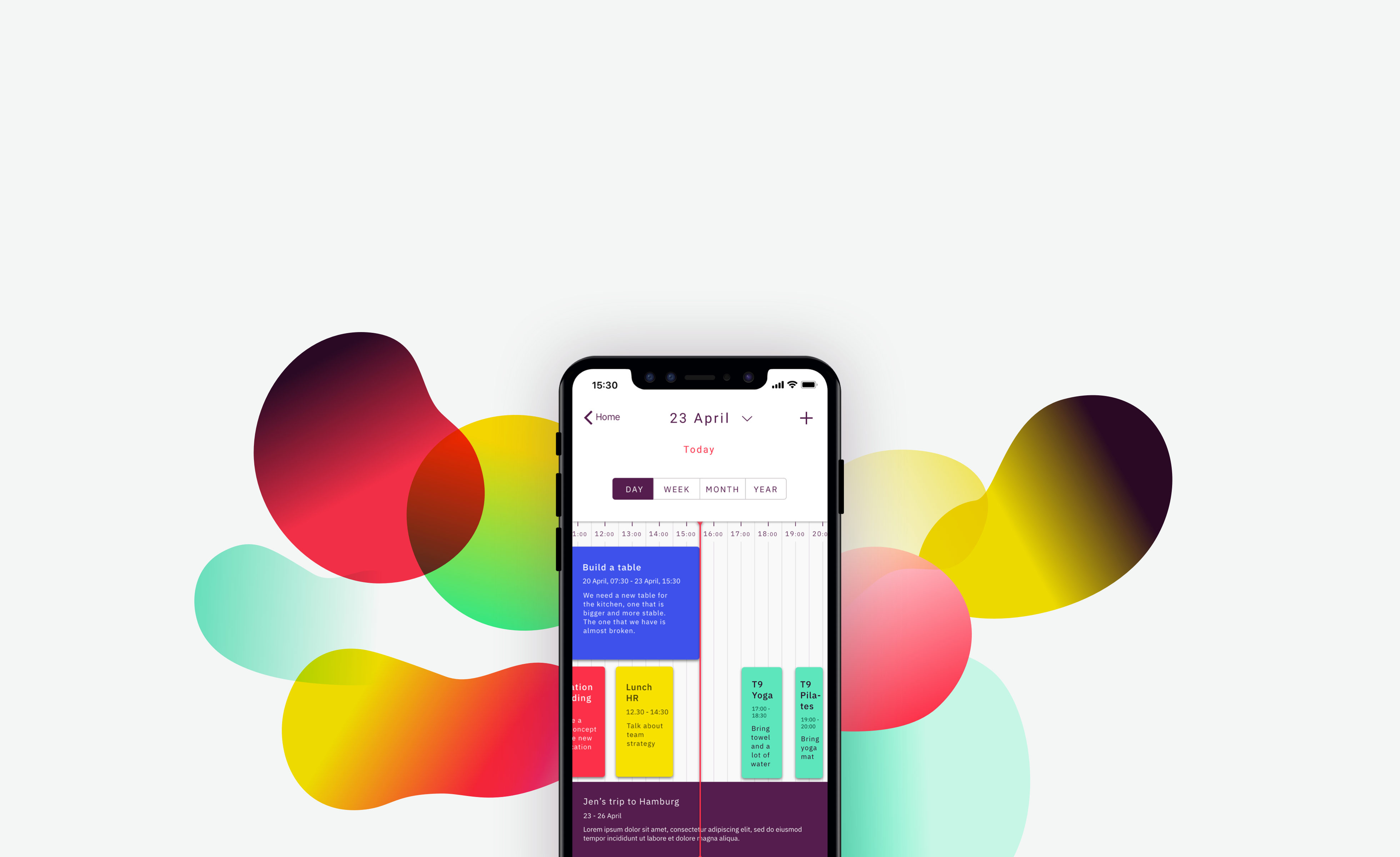
High-fi mock ups
This is the last step of my design process. I follow best practices for project documentation and order all the deliverables and documents belonging to the design process in organised folders so that everybody in the team can easily find them. I then polish my designs and create high-quality mockups and product presentations to show them to team members and stake holders. With them, Tasko’s team should have everything needed to start building it.

Tablet screens
Timeline calendar: Day view

Kanban project

Desktop screens


Product presentations

Homepage

Calendar day view

Kanban project

Notes


Leave a Reply
You must be logged in to post a comment.