
My responsibilities
In a small team, I was able to to work side by side with CEO’s, designers, content creators and developers during the whole development of the project. As a UI & UX designer I -together with two more designers- planned a lean design process to design the first app’s M.V.P. I executed standard user-centred methodologies and followed design-best practices to create an intuitive and enjoyable product that fullfilled our users wishes and needs.
Design process
Equalista’s design process was focused on the Lean methodology:
• Involving potential users early on
• Testing designs
• Analysing user insights to develop user-centric features

1.1 Company’s strategy
Strategy Workshop
During my first week at Equalista I took part of a company-strategy workshop. Here I learned about Equalista’s vision, mission and goals. We discussed the product’s target groups and main user needs, and brainstormed ideas for features for the Minimum Viable Product afterwards. This concluded in a Product Vision Board and a Business Canvas.
Business plan
I subsequently carried out in-depth research about the company’s business plan and strategy to develope the first MVP idea.

Analysing previous work with mind-maps
Mind-maps are an essential part of my product designer toolkit since they allow me to easily organise and explore complex ideas in a visual and clear manner. I created several mind-maps with previous Equalista research work and proposals to form an holistic understanding of the product. I turned spread sheets, text documents and tables with plane information into diagrams with hieranchical and interconected parts. During the development of the project I would reassess the validity of this mindmaps and modify them to streamline emerging research results.


1.2 Competitor analysis
Understanding how a competitor presents itself, what business strategies are they using, what value they provide, and learning from their strengths and mistakes is a great help to define a product’s position it in a competitive market.


Benchmark analysis
We narrowed down +100 competitor apps to the 10th most relevant ones for us and conducted SWOT analysis to identify strenghs, weaknesses, threats and opportunities.
The apps that we analysed were:
• Headspace
• Neuronation
• Happify
• Khan Academy
• Quizlet
• Duolingo
• Elevate
• Fabulous
Benchmark analysis summary & design recommendations
We summarised relevant analysis results about each benchmark app in a spreed-sheet. We subsequently extracted relevant features and design strategies that our closest competitors successfully used and translated them into growth oportunities for our app (next slide).


1.3 User research
User research is fundamental in order to be able to empathise with our target users, and to discover and validate assumptions about their needs and interests. This was essential to determine the best features for Equalista.
Target users
I used the target-groups mind-map that I did before to validate assumptions about our target users.
User interviews
User interviews helped us gathering qualitative data from early adopters, get to know our users better and validate preconcieved assumptions.

User surveys
Equalista’s social media channels were used to recruit early adopters and gather quantitative insights.

Persona profiles
Users are the most important source of feedback when it comes to effective UX. With the information gathered until now, we created persona profiles. These personas:
- Represented major user groups for Equalista.
- Focused their needs and expectations.
- Gave a clear picture of how users would use Equalista.
- Aided in uncovering universal features and functionality.
- Described real people with backgrounds, goals, and values.
- Helped to test assumptions and prioritizing features quickly.


Redefine MVP
I used the test results from the user surveys and the user interviews to iterate in Equalista’s MVP. The crossed-out features are the features for which users showed the least interest, for this reason we deleted them from the MVP. The features that stay due to the interest showed by our target users, stay for further testing.

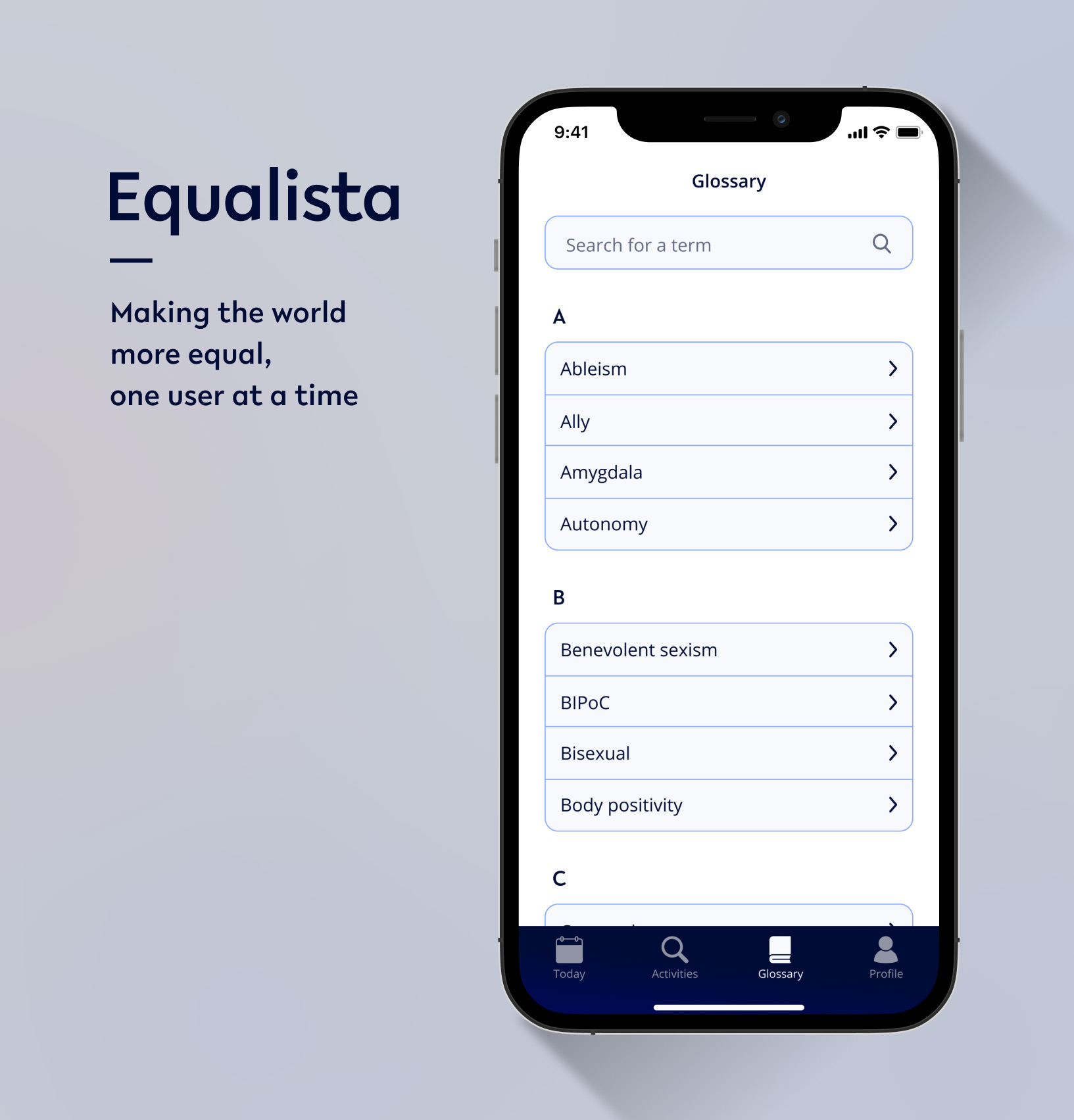
1.4 Information Architecture
The information of an app can be hard to navigate without a logical and well thought out system. An intuitive and effective information architecture is thus essential to enable users to navigate the system smoothly and find what they are looking for.

Sitemap
Due to the complexity of Equalista’s Information we devided its sitemap in sections. This helped us to lay out Equalista’s page hierarchy in clear blocks.


2.1 Defining scenarios
We created scenarios to:
- Extract key tasks and define user flows for Equalista.
- Give guidance to early adopters during coming usability tests.

2.2 User-flows
A user flow is the path taken by a user on a website or app to complete a task. This was the user flow that we made for Equalista’s sign-up and login process.

2.3 Low-fi wireframes
We used Figma to design the wireframes pertaining to the user flows that we previouly defined for the core features for Equalista.


2.4 Low-fi prototypes
The wireframes allowed us to create low-fi digital prototypes ready to test. If a picture is worth a thousand words, a prototype is worth a thousand more!. Prototypes give insight into user flows, or how a user advances from point A to point B. They are extremely practical to communicate design ideas to group members and stake holders, and they can also be used in usability tests to discover pain points and other usability issues early before launching a product.
2.5 Usability tests
Usability testing with prototypes at an early stage allowed us to tackle usablity issues and tweak designs before adding greater detail to the product and spending too much time and resources on it. We handed interactive prototypes to early adopters to test structure and features, aiming to create an end-design with the least usability issues possible, and the hightes rate of user satisfaction. This would ultimately prevent churn rates after installations, increase the app’s reputation and thus user base. Usability testing increase the chances of apps to stand out of the competition and become useful and enjoyable for their users.

3.1 Design System
The last stage of the design process was about polishing up the designs, incorporating visual elements to the interface to increase the product’s visual appeal, professionalism, brand value and usability. I created a Design Sytem to implement this, and also to ensure style-consistency among screens and elements. A well thought and consistent Design system served to enhance Equalista’s efficiency and user-friendly experience.
Brand voice
To get Equalista’s users connected and delighted with the app, I redesigned their former style guide and created a design system that kept the feel and tone of Equalista’s brand voice and product vision.

Fonts
Equalista chose the Lelo font designed by Katharina Köhler for its legiblility and contemporary touch. We chose Open Sans for the body font for its legiblility, well balanced proportions, kerning and tracking.

Type-scale
Equalista’s type scale included a range of styles that supported the needs of the product and content.
I chose the “Mayor Third” Type Scale (x1.250 increments among text sizes) to produce an harmonious and well balanced text-hierarchy.

Color palette
Equalista’s aim to suggest a knowledgeble, fresh and bold brand drove us to choose a vibrant color palette with contrasting colors.
Paying special attention to accesibility, we for example avoided using color combinations in our interface that visually-impaired people can’t differentiate, like red and green together.

Logo redesign
I redesigned the Equalista logo in order to adapt it to the new styles and create a cohesive brand and product experience.

App layout
The Equalista layout system was hybrid: after serious considerations, we decided to apply the most accepted elements from both main app platforms, iOS and Android, to use in our design. I consulted Google’s Material Design and Apple’s Human Interface Guidelines, together with the design trends by mayor apps to define our layout rules.

This resulted in visually balanced layouts, were most measurements aligned to an 8dp grid, which aligns both spacing and the overall layout. Smaller components, such as icons and type, aligned to a 4dp grid. Some special screens or elements -like the tap bar- followed variations of this alignment system. This enriched the visual appearance of the app.

UI Kit
To be consistent with our brand voice and feel we choose minimal UI elements that were accessible and predictable to help users navigating the system intuitively.

3.2. High-fidelity prototype
I polished the app designs and created a last high-quality prototype with the main screens of Equalista. This allowed me to run the last usability tests with team members and early adopters. This last test focused on the app’s apperance and visual design.


3.3 End designs & presentation
After iterating in the app designs for the last time, I followed best practices for project documentation and ordered all the assets and deliverables in a clear manner so that everybody in the team could easily find them. With this, the developers team had everything needed to launch the app. Equalista was released in September 2020 receiving an average of 5 stars from its users in both, the Apple and Google stores.


3.4 Marketing materials
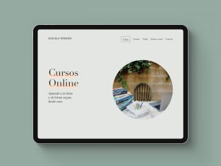
While designing the app I also designed marketing and editorial materials. Among other things, I designed a responsive website, social media posts and banners, the graphics for a kick-starter campaign, business cards, stickers, post-cards, and a product exposé.


Thanks for watching