Mini Case Studies
📋
This are brief summaries of my recent experiences at Oculid (acquired by Tobii in 2023) and Tobii.
🤐
To comply with my NDAs, I have omitted confidential information.
🙋🏻
Get more details about each project upon request!
Case study 1
Oculid

Screenshots of the mobile app, SaaS platform and website redesigned by me.
Overview
Oculid was a 12 people startup based in Berlin. An AI-powered SaaS tool for remote eye tracking studies, used to gather user insights and analyse visual attention and interactions of digital products on mobile.
Oculid’s marketing video when I joined the startup
Oculid products
👩🏻💻
Web Platform
For UX and Market researchers to create remote eye tracking studies.
📱
Mobile apps
For test participants to run the eye tracking studies remotely.
🖥
Website
To showcase products and help users with guides.
When I joined Oculid, all products were in the MVP stage
🐣
Problems
This were the main problems Oculid faced when I joined the team.
Inconsistent design
Lack of visual unity and cohesion among different products.
Feature gap
Missing essential features like a sign-up process and advanced data visualisations.
Churn
Occurring at multiple points in the user journey in web platform and mobile apps.
Low data quality
Due to poor participant behaviour during remote eye-tracking tests.
My work
I focused on these key areas to drive improvements.
My work
🎯 Design strategy
🔎 UX research
✏️ UX copy
🎨 UI & Visual design
📐 Design Systems
🧑🏻💻 Web design & dev
Team collaboration
To redefine the roadmap and plan work:
To discuss ideas and hand over designs:
👩🏻 1 Product Owner
👧🏼 1 UX Researcher
🧑🏻 1 Product designer 👈🏼 Me
👨🏻🦱 2 Data Scientists
🧔🏼 1 Front-end dev
🧔 1 Back-end dev
🧔🏽♂️ 1 iOS dev
🧑🏼🦱 1 Android dev
Research 🔬
Previous research identified problems, but it wasn’t always clear WHY those problems occurred. I conducted these methodologies to better understand the roots of important problems.
Heuristic analysis
I tested the web app and apps documenting places for improvement.
Usability tests
I recruited real users to test designs while gathering user insights.
User interviews
helped gaining a better understanding of the experience and perception of the products by our users.
Persona profiles
I created persona profiles and progressively developed them to consolidate the information gathered about our users.
User journey mapping
I mapped user journeys noting places for improvement.
Solutions 🛠️
UX research helped understanding the “WHYs” of the problems. This is how I tackled some of them.
To reduce design inconsistency:
Design System
I expanded and improved the design system in Figma, adding important sections and components, progressively applying it to all products to enhance consistency.
Accesibility & consistency
Applied accessibility principles like WCAG & W3C to improve accessibility, and a minimalist design to reduce cognitive load and improve clarity.
Custom graphics
Created icons and illustrations to unify the visual style across products and better support instructions.
To reduce churn and low data quality:
Fix user journeys
I designed new screens, UI elements, user guides, landing pages and emails to fix user journeys and help users achieving their goals successfully.
Build trust
I addressed the lack of trust in the mobile app by emphasising privacy features early on, reorganising the structure and permission flows and improving the overall visual design to evoke a more professional-trustable look.
Onboarding
I introduced story-telling and micro-copy techniques, together with a clear order of screens, instructions and illustrations to better guide users, in both the web platform and mobile apps.
To reduce feature gap:
Sign-up flow
I designed a sign-up flow from scratch to automate account creation and gather user data.
Email flow
I redesigned and recoded all emails derived from the platform usage to emphasise key information and enhance clarity.
Dashboard sections
I redesigned the analytics dashboard with eye-tracking metrics to enhance understanding and clarity, and designed new sections like AOIs (Areas Of Interest) visualisations.
Examples of end-designs with illustrations made by me:

Impact 💥
Measured through usability tests prior to launch and data analytics after production.
Reduced drop-off rates
Clearer onboarding and instructions in the mobile apps improved test participant behaviour and proved to be effective in reducing participant’s drop-off rates by 35%.
Increased data quality rates
A better participant behaviour during the tests increased the number of participants that delivered high quality data by 20%.
Resolved usability issues
Of the 120 usability issues identified through usability tests in the Oculid platform, over 65% were successfully resolved, significantly increasing the experience in the platform.
Cohesive and accessible design
By applying an improved and expanded design system across all Oculid products—web platform, mobile apps, and marketing website—I significantly increased visual and functional consistency. This not only enhanced the brand’s professional appearance and built trust from the first interaction, but also improved usability and accessibility across touchpoints.
Company acquisition
The refreshened visual design and ease of use of the Oculid products were cited as a key factors in its successful acquisition by Tobii, the global market leader in eye-tracking technologies.
Career advancement
My contributions to Oculid’s growth and product quality enhancement led to a promotion offer during the Tobii acquisition. I was surprised by the offer, as I hadn’t asked for it, but it made me really happy, as it reflected the trust and recognition placed in me by my team.

After Oculid’s acquisition in 2023, I started working for Tobii remotely. I led UX initiatives to develop various AI-powered SaaS solutions that leverage eye tracking to help companies analyse user behaviour, attention and intent on mobile devices, but also on desktop and different location settings.
Case study 2
Tobii UX Explore
Tobii UX Explore was the continuation of Oculid under Tobii. As the only designer for Tobii UX Explore, I was instrumental in transitioning all designs to Tobii and later adapt and help scaling the product while meeting Tobii’s high standards for design quality and usability.
I collaborated with 3 designers to gather the requirements and materials that were needed for the transition. I adopted Tobii’s Design System to redesign and advance all Oculid products, while taking the chance to solve old-known usability issues.
Examples of end-designs with illustrations made by me:


Case study 3
Sticky
Sticky is a tool for market researchers to create and analyse remote eye-tracking and attention-emotion studies on desktop and mobile screens.
Task
I was responsible for redesigning the AOI (Areas of Interest) Editor screen to make it more intuitive and introducing a key new feature: Dynamic AOIs.
Context
AOIs are a core metric in eye-tracking research. They allow researchers to define specific areas on images or videos to analyze how much attention those areas receive using various metrics.
The new Dynamic AOIs feature leveraged an object-tracking AI model created by Tobii data scientists to enabling AOIs to move with objects in videos.
Previously, users had to manually define static AOIs frame by frame—a tedious and time-consuming process. So solving this would be a major step forward in efficiency and usability for our customers.
Challenges
Designing this feature came with significant technical challenges due to the limitations of the AI Objer-Tacker model. I worked closely with a data scientist and a front-end developer to understand those constraints and deliver the best possible solution.
Impact:
The redesign was very well received by internal teams at Tobii—including Customer Experience and Insights—as well as by early adopters. A follow-up survey, which I helped the CX team draft, helped evaluate customer adoption and satisfaction. Initial results showed high engagement and positive feedback via in-app surveys and pop-up ratings.
Design previous to my work:

My redesign:

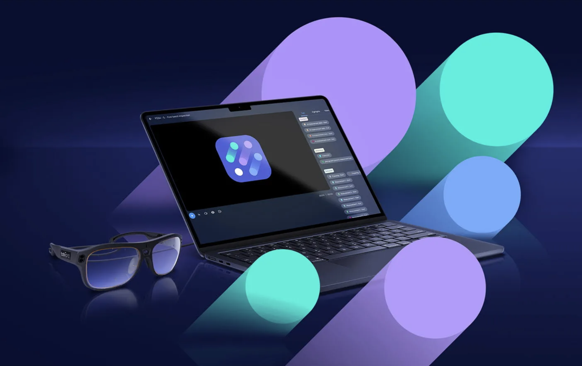
Case study 4
Glasses Explore
Glasses Explore is a cloud-based eye tracking SaaS tool powered by AI for understanding human attention and intent. It reveals the nuances of human awareness – what people pay attention to, what they don’t, and why. It unpacks first-person perspectives in real-world contexts to help build better user experiences.

While I wasn’t part of the core design team and didn’t contribute to the UI design directly, I supported the product’s development by running usability testing, analyzing user interactions, and providing expert UX feedback.
Glasses Explore and UX Explore were developed in parallel at Tobii as part of the same family of SaaS research tools. I collaborated closely with both teams, sharing design systems, insights, and best practices to ensure consistency and a cohesive user experience across this Tobii product suite.
Conclusions
Transitioning from a small 12-person start-up to a 600-person company was a significant leap. Initially, I felt a bit overwhelmed by the number of meetings, but over time, I came to enjoy collaborating with plenty of senior designers, developers, product managers, insights, and CX teams. Meeting so many talented professionals and advancing our Oculid babies further –together with another advanced SaaS products was a truly rewarding experience!
Leave a Reply
You must be logged in to post a comment.